top of page
Practical Skills
Skills Development Week
For my skills development week I am planning to experiment mainly with 3D body modelling and 2D background design. I will be using Maya and Photoshop for my skill experimentation's to make sure that I am prepared for when I am expected to start working ton production for my FMP.
Skills Development #1


For my first skill development I decided to experiment with 3D body modelling, focusing on getting the shape and form correct.
I decided to develop this skill as 3D body modelling is what I will be doing for majority of my production and I don't have any previous experience modelling these specifically. For my research, I conducted a Google search to give myself and idea and give myself the opportunity to grasp the concept of the basic needs for
anatomy/body modelling.
Observations
After familiarising myself with the basic form of anatomy, I decided to look for a tutorial on YouTube that was able to show and teach me how to model a body. I have included a link to the tutorial that I followed, however, in the tutorial they were using reference images to make sure that they achieved accurate results. I was unable to get a hold of the images that were used in the tutorial however I had previously found reference images during my 'Observations' stage.
Tutorial
While modelling, I learnt that although it wasn't tricky to execute it was very time consuming which is the reason why I wasn't able to completely finish the model.
I would deem my experimentation successful because although I didn't get very far with the tutorial I was able to gain a new technique for modelling. I also think that the models I did create in the time frame considering it was my first time modelling anatomy were great.
As of this moment, I am sure that I will be able to execute what I have originally planned for my production due to being able to pick up and understand the concept quickly. I didn't experience any issues when modelling which is a good sign for when it comes to my production however I will make sure to give enough time for me to work around mistakes.
Skills Development #2

For this skills experiment I decided to attempt creating a low poly background using gradients and the polygonal lasso tool in Photoshop.
I have previous experience in this specific skill but to refresh my memory I conducted a small experiment on it. I also haven't used Photoshop a lot so I had to familiarise myself more with the layout of the software.
As part of my research I used a tutorial from YouTube which gave me a step-by-step guide on how to make the background. I didn't refer to the whole tutorial and instead
Tutorial
This skill is fairly easy to execute however it can be very time consuming depending on how detailed you want your background to be hence why I didn't finish the whole piece. I didn't want to waste any time finishing a skill that I have already executed before.
After my experimentation, I now think that the low poly background is suitable style for my idea.
I didn't come across any software issues however I made some errors myself by using the wrong blur selection which caused me to have to restart. There wasn't any hassle caused when overcoming this as everything else was easy to repeat.
During production I will use a different gradient to what was shown in the tutorial.
Composition Activity


We were instructed to take a walk around the college campus and capture images that portray an interesting use of composition. I chose these 5 images as I feel that they display good composition with the use of leading lines etc.
We then had to take one of these images and recreate them in another format. I decided to draw the image using pencil and paper as it would be easier for me to create the lines that are displayed in the image without having to research any software skills.

Here is a quick 10 minute sketch that I created while referencing to the image that I chose above. I worked in pencil and paper and used a variety of line markings to created shadows, shapes and highlights.
Production
Today, we began to work on the production stage for our FMP. During this stage of my project, I am planning to produce an outcome that includes a full 3D model, and a low poly background. This is my future planning for my production stage however, if I am to come across any issues while executing these ideas I will have to make adaptations to my idea and document them accordingly.
I have decided to tackle my background design first and, taking my critiques from my skill experimentation into consideration. I will use two different hues rather than just a variation of shade going froward with my low poly background.
I have already conducted research on this skill specifically so I decided to go back and use the the tutorial I used from my skills development week by refreshing my mind on the tolls that I had to use and which selections to make.
Link to Previous Tutorial


Feedback
+: Style well executed, polished.
- : Unfinished, lack of depth
Interesting point: Nothing specific, low poly style is interesting as a concept.
This is some of the feedback I received from a peer. They have stated that although I have executed it well I could possibly improve the depth in my image by using a bigger variety of shades.
I will respond to this feedback by including a larger range of shades to make sure that I achieve greater depth. Although I think it looks fine as it is I will make sure to at least act on this feedback to see if it makes any improvement.

Feedback Reflection
I acted on the feedback that I received by using the brush tool to create lighter and dark spots with darker hues and shades so that when I applied the 'Average' blur effect the triangles would appear lighter or darker.
This process ate up a lot of time due to having to make sure it was possible to differentiate from different shades of triangles and I had to repeat the same process for almost each triangle that I created.

Feedback
+: Gradient, detail.
-: N/A
I received more feedback from peers. I can see that they did not provide any negative points abourt my background and instead pointed out how the gradient and use of different shades creates an illusion of greater depth.
Due to me acting on my feedback that I had received before on my background, I have improved my design overall. Also because of the majority of my feedback being positive I may make a slight change to my idea.
If I am able to change around my schedule I may consider creating a grid of 4 with the inclusion of 4 different gradient, low poly backgrounds with my 3D model duplicated to be in front of each background.
Overall, I didn't encounter any major issues during this production stage. I did have slight issues with having to go over each triangle that I created as there was often gaps left in between however I breezed through the production of my background.
My only critique would be that my background could be labelled as basic so I may have to revisit this stage and add something else to it to make it more interesting. However, the design of this background fits with the abstract theme.
After creating my background, I decided to start producing my 3D model using Maya.
I have already conducted research on this skill so I didn't have to do any in-depth or new research. Instead, I revisited my previously done research to refresh my memory on the key point needed for this stage of my production.
Link to Previous Tutorial
This tutorial was able to teach me step-by-step on how to create my model however, I am to come across any issues during this process I will have to conduct more research and possibly pick up a better method of how to create my model.
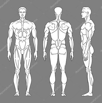
I am also planning to use this same reference image to create the main elements of my model. This reference image includes the front, back and side perspective.


Feedback
+: Good start, easily depicted as a torso.
- : Too rigid, unrealistic.
From this feedback I am able to take that although my model is a good reflection of the human body it is too sharp and rigid to fully resemble it. One suggestion that was made was to add more subdivisions to make my model smoother and resemble more of what I intended it to look like.
I will make sure to add more subdivisions in my next session so that my intention is clearly communicated to the audience.

Here is my attempt at modelling the lower half of my model.
While modelling this part of the body, I was working from the side perspective using the extrude tool from the bottom face of the torso. After I had finished modelling it against the reference image, I switched to the Perspective view and both of the legs were attached as one instead of two separate objects.
This was just a human error however I had to delete the whole lower half of model as I was unsuccessful trying to split the lower half into two.
After this attempt, I was able to successful model both of the legs from separate poly cyllinders.

Today I decided to try out a new method of modelling to see if it cut down any time for me as it was suggested to me that I only modelled half of the body and mirrored it.
I modelled half of the body from a singular poly cylinder however I have a variety of issues when trying to mirror ir, due to the edges of the shape being rounded it was hard to connect the two of them. I also had issues with rotating the mirrored subject, every time I tried to rotate it to match the left side of the model, some of the vertexes would turn inside out and would scatter.
I wasn't able to find a solution for this issue so I deleted this version and just decided to continue with my progress with my old model.

Idea Change
Due to my progress being delayed, I have decided to adapt my idea slightly. I have had the idea to instead keep all aspects of my model detached.
I have come to this conclusion because I have come across many issues while using the 'Bridge' selection in Maya. I originally wanted my model to be an all-in-one body however after this design change I also feel like it fits with the theme so my idea concept wont be thrown off the rails.

While working with this method specifically I found that although my model appears to be smoother in some places compared to my previous model, it also made it harder to create the model as a whole.
I think that the change to my idea fits my overall theme better as I am leaning towards a more abstract outcome.

Feedback Reflection
Taking my previous feedback in consideration, I added more subdivisions to the head of my model.
Although the head of my model appears to be smoother than the limbs and torso, I am not happy with this method of modelling at it's inaccurate and inefficient. On the other hand I am happy with how smooth the object looks so this will be my step forward when working with the the arms, leg and torso.
Idea Change
Today, I decided to go over all of my previous work and start to brainstorm what I could do to make my idea more interesting. After my idea change to my 3D model, I realised that I had freed up more production time for myself which led me to the idea of designing and adding more backgrounds.
I think that this idea change will highlight the theme of my project more and help me to produce a more unique outcome.
I decided to conduct research on the famous pop artist, Andy Warhol as his work has inspired me to go forward with this idea change.
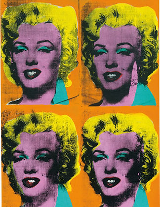
Looking through Warhol's work you are able to notice the reoccurring theme of mass production. Warhol's signature art can be often recognised by him presenting his pieces in large scales.
After researching about his work, it gave me the idea to present my work in a grid of 4 with the inclusion of my model (coloured & textured) displayed in front of 4 different backgrounds.
I will now have to dedicate more time to designing and creating backgrounds as all of the main elements of my 3D model have been created and just need to be polished and textured.

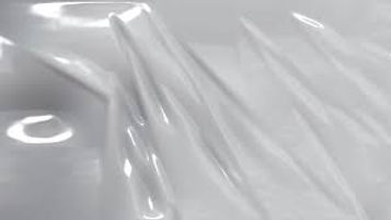
Here is the progress picture for one of my background designs. Sticking with the abstract theme, I did some research on different abstract images and backgrounds. While observing these different images and backgrounds, I came across an abstract fibre background that had a link attached to it for a Photoshop tutorial. Upon analysing the background, I realised that it could potentially be a great background to fit my model and theme.
Tutorial
This design required that I used an image in order to distort it to get the fibre effect.

I was able to find an image that had a good shade variety which would be beneficial for me as the fibres will be easy to differentiate between and create a good sense of highlighting and shadows.

In this session I was developing my Photoshop and 2D skills and more specifically working on my background designing. I created this background with the intention to contrast with my model and my low poly background. I used a variety of different selections and tools in Photoshop to create this background including Mezzotint, Radial Blur etc.
This background contrasts perfectly with my low poly background from the colour palette down to the shapes found in them. This background includes the use of different shades of green and leading lines whereas my low poly background includes two different hues, rather than shades, and has a lot of triangles.
Next time I could possibly add my own knowledge of skills and add my own twist to this background by using other tolls that weren't stated in the tutorial. Although I used the tutorial to guide me I didn't completely follow it and decided to use the tolls used in my own way.


Here, I was developing my background design. I used the tutorial above to guide me through making this as I thought it would be good to experiment with a two-hue image rather than working with different shades.
My purpose in creating this was to see if it would increase the contrast between my backgrounds, it is in the same style as my previous background design however I feel like my first one fits better as my low poly background already has a range of blue hues.
I like how the pink and blue hues transition in this particular background but I think that my first outcome will fit better. I used the same tools as last time and followed the same steps but I think it has something to do with the images I chose to work from in the first place. Next time I would possibly add something else to my design and add filters before adding the radial blur into my image.
Research
For my next background design I had an idea to gain inspiration for a textured background that resembled 'plastic'. I decided to get a few reference images and see if I was able to translate it into a background.

Using these images for inspiration, I decided to look on YouTube to see if there were any similar products made in order to help me gain tips to create the plastic texture. I wasn't able to find any similar pre-existing products so I decided to look on a few forums to see if there was anything that might be helpful to me.
Link to Forum
While researching how to make a plastic textured background I stumbled on a forum that mentioned the plastic wrap filter in the Filter Gallery selection on Photoshop. The filter plasters over the image and creates a plastic texture on top. I decided to experiment with this filter and decided to see if it would work with an enviroment image.

This is the finished outcome after using the plastic wrap selection on the Filter Gallery. To create this background I used the radial blur selection to create an array of colour and applied the plastic wrap filter over the top of the blurred image.
Although this is a basic design, it fits with my theme and displays an almost pastel like colour palette. I also like how there is more focus on the centre of the image due to the highlight created there, it looks shiny which also adds to the texture of the background.
I didn't come across any issues while creating this but it was trial and error, I altered the radial blur to different layers and used the plastic wrap filter which created different outcomes each time however this one portrayed the style I had planned.
Next time, I would consider using more tools and filter selections to get a more unique outcome.
Feedback:
First set of Feedback
+: Very accurate modelling of a person and detailed pieces of artwork.
-: Lack of texture and colours to the model.
Interesting Point: I like the style of the bottom two artworks.
Second set of Feedback
+: Fairly accurate proportions which is difficult working in 3D.
-: Not extremely detailed model but it's still in the early stages.
Interesting Point: The backgrounds are a very different style but are still pleasing to look at.
Third set of Feedback
+: I think that you have portrayed your 3D skills very well and your 2D backgrounds and use of colour are executed well.
-: To improve, I think the 3D model should be made smoother and it looks flat and rough in some places.
Interesting Point: The 2D abstract art style is very pleasing to look at, the contrast between the model and backgrounds create an interesting scene.
Response to Feedback:
Reflecting on my first set of feedback, I can see that they pointed out the lack of colour and texture in my 3D model. I am aware of the lack of development in that area however it is where I plan to work on next once I have gotten all of the aspects of my model to a good standard.
Looking at my second set of feedback, they pointed out how I have created accurate proportions which can be quite difficult to display. They also mentioned the lack of detail and realism in my model. This is something that I was told from my last set of feedback so I will aim to add more subdivisions onto my model and round the vertexes more so that it looks more realistic.
The same point was also brought up in my third set of feedback which highlights to me that this is a red area on my model that needs to be improved in order to move forward.
All of the interesting points that were made pointed out the contrast between my 3D model and the 2D backgrounds, due to my idea change I will be experimenting with different styled backgrounds to fit my 4 background criteria.

Here, I decided to follow through with another background design. I decided to experiment with another to diversify and possibly improve my options when it comes to choosing the 4 backgrounds that I will be presenting my model on.
This idea came to me with inspiration from my abstract fibre background. I did some research to find similar products to what I had in mind and I came across a tutorial that showed a step by step guide on how to created a Liquid Paint Marbling Effect.
Tutorial

This tutorial was up for interpretation and gave a short guide on how to create a variety of depths in backgrounds. I took some tips and tricks from the video and decided to apply my own knowledge while creating these pieces.
I was able to create a series of 4 outcomes in the same amount of time it took me to do one and each of them vary in shape, saturation, depth and shade.

Purple to Black Gradient

White to Purple Gradient

Purple to White Gradient
Purple to White Background
I have been developing my background design again by creating a series of 4 different variations.
I decided to follow through with this as I want to achieve maximum contrast when it comes to my backgrounds. I was using a variety of selections from the drop down menu in the 'Render' tab.
An example of one of these selections would be the clouds, in which I rendered in a black and white version and used a distorting tool and later added a gradient overlay to create the paint marbling.
The first version of this background, Purple to Black Gradient is the one that fits the least. I feel like this variation contrasts the least with the rest of my background designs due to the dark complexion of the gradient.
The second version of this background, White to Purple Gradient has too much depth. I feel like although this would be a good component against the rest of my backgrounds, it is too busy and there is too many lines which will lead away focus from my 3D model.
The third variation of this background, Purple to White Background is the one that I think fits the best against the rest of my backgrounds. This variation has the same amount of depth as the first however the white gradient substitutes the black gradient. It also gives the impression of a silk-like texture which also contrasts with my other backgrounds as they are quite rigid and bold whereas this background is soft and easy on the eye.
The last variation of this background, Purple to White background is also a bit busy with the amount of lines that are being used. This background has a lot of negative space and also gives off a metallic texture. Next time I would include more purple to even out the negative space.
I think that the tools and techniques I used prove to be more effective in the third outcome.


Although this isn't the design idea I had in mind while creating this effect, I feel like it fits in the best with my other backgrounds and the texture is the most pleasing of them all as it has a nice balance.
Next time i would possibly add more filters over the top to see what effect it gives the background.


These are the four backgrounds that I am considering using in my grid of 4. Each background is unique and all of them differ in colour, shape and texture with some looking smooth and others rough.
There is a big contrast between the 4 and none of them look the same which is the effect I wanted to achieve when creating them.
I have used a variety of tools and have developed my 2D skills massively while creating my backgrounds which is something that I planned to do before starting production. I have become more familiar with different tools and the software overall which was a goal for me.
I feel like these backgrounds will be really effective if I present them in a grid of 4 and it will really communicate the idea of Diversity. I didn't experience any major issues that delayed my background design which has opened up more time for me to work on my model.
If I was to do this again, I would make sure to do a wider range of research from the start before starting production to make sure that I have all my ideas ready to execute as soon as I am able to go into production however this was due to an idea change which means that I may have to be more prepared in advance next time.


Now that I have finished producing my backgrounds, I have returned to working on developing my 3D model.
As you can see in the images above, the head of my model is smoother than before due to me adding more subdivisions however, the lower half of it towards the neck is busted is rigid and very skinny. I have tried many workarounds for this but everything I tried ended up resulting in the same issue, the vertexes would also scatter if I tried move it sometimes which I had no clue how to fix.
I decided to research a more efficient method of modelling the head so that I could get it more accurate and possibly smoother.
Research
Whilst conducting my research, I came across this tutorial which was able to teach me more specifically how to get the head proportions more accurate against reference images. I feel like this method will prove to be more effective as it is catered towards just head modelling rather than the previous tutorial I used against my reference image.


Here, I developed my 3D modelling skills and more specifically my method of head modelling.
This outcome has proved to be more successful than my previous model as it is more accurate and it has less flaws than before, the neck area of my model is more defined and smooth.
I used a cube to model the head and cut it into 1 dimension.
I think that this new method has majorly improved the design of my model and it fits the rest of my model more than before. The skills that I used proved to be more successful than the previous skills and techniques that I used. I didn't come across any issues like before and it was easier to model and fix the form than my old model.
Next time, I will make sure to use the poly cube rather than the poly cylinder and look through multiple methods before conducting my production as it would cut time and improve efficiency.


This is how far I have gotten with production of my 3D model. I am happy with my progress however I have made many mistakes while modelling and I have now learnt how to combat these issues faster next time for a more effective outcome.
During this process I found the head of my model to be the most time consuming as I was often stuck trying to smooth out the edges by adding more subdivisions, smooth edge tool and inserting edge-loops. The arms and legs were fairly easy to make and didn't cause me any major setbacks.
I still have to model the hands and feet for my model for it then to be complete, I have tried to research ways to attach all of the limbs I have modelled but I was unable to come across anything that was able to help me and I was often getting errors in the software.
I have adapted to this change by instead of having a full body model, I will position the body parts in different ways to create different poses. This will fit perfectly into the theme that I am currently going for and it also still has a strong link to the project as each body part will be differently coloured and the message behind it would be that every part of you makes you whole.


Here is foot design for my model. I dedicated this session to creating a foot for my model following a tutorial I found on YouTube.
Research
This tutorial that I used was easy to follow and it helped me to produce a polished final piece. My model is fairly accurate and I didn't have to work against any reference images. I followed the tutorial however I took the tools used and personalised the method to my needs, I needed it to fit the rest of my model.
This is a specific skill that I have never touched on before so my research proved beneficial for my production. I have developed and improved on my anatomy modelling extensively however I still have to touch on a few areas such as decreasing the length of the toes to match the rest of the proportions of my model.
In my opinion, I think that this model brings the model as a whole together and the tools that I used such as the 'Bridge' tool improved my model by increasing the accuracy. I did come across a few issues with this tool as it wouldn't attach the toes and would give me an error message saying that the edge counts were unequal. I was able to find a fix for this tool by using the edge loop tool which allowed me to switch to the default polygon mesh display and cut more edges into my model so I could get the edges equal to each other.
Next time, I will be able to work around this issue quicker. I may also conduct more research into how to get the edges equal without using the edge loop tool or possibly use the fill hole selection to replace the foots empty face and extrude the cubes from there after cutting in 4 edge loops to leave 5 different faces to extrude from.


Here is the production process for my hand models. Here, I used a tutorial on YouTube while also applying my own knowledge from my foot model as the process was similar to how I created the foot model.
Tutorial
This is the last model I needed to create to finish my 3D model production. The process of hand modelling was fairly easy to follow and execute as I have already experimented with this process, I didn't come across and problems however one critique I have on this would be how rigid the knuckles and joints on the fingers appear.
The tools and techniques that I used proved to be effective in my process as for the most part, my model looks how I imagined it too. I managed to shape the fingers on the hand to bend to create a more realistic form.
The only minor issue that I experienced was the vertexes on the hand twisting around each other which resulted in me having to reshape a lot of the vertex points on my model. I was able to get them back to the original form by adding in a few edge loops to create more points so it appeared more spheric.
Next time, I would work on the knuckles and joints of my model to make them appear less rigid as they are quite sharp compared to the rest of my model. I would also add in more flat faces towards the end of the finger to make it appear as fingernails to add to the realism.
bottom of page