top of page
Context
Diversity
Personally, I define 'diversity' as the different attributes of individuals and groups that act as the jigsaw pieces in society. Diversity is a key component in order for us to function as a society; our differences should be celebrated as we come together as a whole.
The topic of diversity is very broad and covers a variety of different subjects.
Culture
Culture consists of found behaviours and norms within different groups of societies also their beliefs, practices, habits, religion and laws.
An example of a cultural holiday would be

Día de los Muertos
Day of the Dead
This is celebrated on the 1st and 2nd of November in Mexico however it is also celebrated by the Latin American population in other countries. This holiday celebrates deceased relatives as they believe the dead would be insulted by sadness or mourning.
Culture is a group of unique ideas and individuals.
I researched a few other cultures and each one differs from each other, they have similarities but nonetheless they're all special to each society of people. I learnt that they are all important to know and to learn about to see how each culture ties into each other as it is not limited to one group. Many other countries celebrate the same holiday in different ways.
I could potentially use this in my project by catering my project to one specific cultural event, as mentioned above. I could also cater my work towards celebrating cultural differences or dissimilarly create a piece of work that could showcase what all cultures have in common. Otherwise, I could use a broader spectrum such as 'belief' which could tie into any culture as each group of people usually have their own set of beliefs and rules.
Social Classes
Social classes are often used to define where people stand in society. The wealthier and upper classes are deemed at the top of society whereas the working class works under the upper classes which places them at the bottom of society. This is a traditionally old system that has been used since the 19th century.

Each social class will experience a different life. Some may experience similar events but overall, they will have experienced a different lifestyle.
These lifestyle experiences are what define our future in most cases however in today's society there is every possibility that your future is instead not defined by your social class but for other reasons. People in their classes all possess the same socio-economic status.

Here is an example of a piece of work that represents social class.
This represents the working class being the base of all of society, working under the upper classes to support their lifestyles.
This links into the theme of diversity due to the different experiences one might have in different societal classes. The upper classes wouldn't exist without the working class and vice versa.
I could possibly explore this topic in my work by catering my work towards one specific social class status, something that they can reside and relate to. Another way I could incorporate this topic into my work could be to shed light on and bring attention to the issues that go hand in hand with social classes.
Or I could metaphorically include a message in my work regarding social classes.
Age
Generational differences play a big part in how diverse the world is today. Each generation has had different upbringings, beliefs, societal norms and laws that another generation might not be able to understand.

This illustration represents Generation Z stereotypes. We have grown up in a world surrounded by technology and social media, something that no other generation before us has experienced like we have as a generation. Due to this upbringing, we are able to access a lot of information at young ages that older generations weren't able to get a hold of at this stage in life.
Generation Z is more technologically advanced, politically advanced and socially advanced than the previous generations, which leads to a massive divide.
However, every generation up until now has allowed us to get this far, so having such a diverse age dynamic proves useful in today's world.
In my project I could explore the idea that I just mentioned about how, putting our differences aside, much each generation needed each other to get where we are today. I could produce something that resides with a particular generation, events like WW2 which generations before us are able to understand or a much more modern, technologically based piece for today's generation (exploring social media etc.).

Seaty is a French, Contemporary art creator. His work has been showcased in many galleries around the world.
He likes to create abstract and realistic portraits of those from different ethnic minorities, tribes and cultures. When painting his portraits, he often paints the people themselves in black and white and then he includes a brightly coloured object to draw people's eyes to it.
Additionally, while he contrasts between realism and abstract and also black and white and vibrant colours he also includes accents of graffiti and pop art.
His three key words when creating his pieces are, "colourful, urban and modern".
Upon analysing his portraits I am able to see his goal and focus in his art. He focuses a lot on representing ethnic minorities, mainly African and Asian women however he does also explore other ethnicities.
The contrast in his work also adds to the theme Diversity due to how big the differences are in the styles that he includes, it is unique and something that I've never seen before.

Personally, I really like Seaty's expressionism in his work and how he appreciates all different types of culture. I am inspired by his way of work and the messages that link to his artwork.
I feel like this artist also works similarly to the famous Banksy as his work consists of combatting several social issues and also how he often works in black and white with splashes of colour.
The comparison between the two is that they both showcase art that everyone else is afraid to do and they do it flawlessly as their messages in their work are clear and bold.
The Diversity theme is widely used in Seaty's work as he doesn't limit himself to just one society of people, he branches out to reach new limits and to show to everyone that every culture, every individual, every religion and every ethnic background is beautiful.
Research: Stereotypes
- Culture
- Sexuality
- Societal
To stereotype is to group a certain group, race etc. together and make an assumption about them without any prior knowledge.
We all make up our own assumptions about individuals and groups, some positive and some negative; negative assumptions can be brought on by previous experiences with someone.
An example of stereotyping could be racial profiling. An example of a 'positive' racial stereotype would be assuming that all Asian people are smart, however a negative stereotype would be to say that all Muslims & Arabs are terrorists.
One person doesn't define a whole race of people.
Another example of stereotyping could be sexual profiling. This is the assumption that society makes that if a man is to act feminine, they are gay. This is reciprocated with women that if they are to act masculine, they are lesbian.
People that make these assumptions often don't support homosexuality.
It has been proven that positive stereotypes come with consequences for the minority group that has been labelled these stereotypes. Taking the assumption from above about all Asians being smart and good at maths leads to them being treated as a tool in the workplace rather than being treated like human beings.
This also creates pressure for the rest of the community as they are almost forced to live up to their stereotype and if they don't it may affect the person in question.
Profiling people's actions to a certain sexuality is harmful if they are taught that homosexuality is to be looked down on. Toxic masculinity becomes a learnt behaviour if they are shunned for showing any feminine traits which causes the male population to suppress their feelings. This assumption that showing your feelings as a male is feminine is one of the key aspects as to why most suicides consist of men.

This is an example of displaying gender stereotypes in art. This is suggesting the idea that there is the 'working man' and the 'stay-at-home woman'. These practices were once used in society however now they are just stereotypical gender roles.
I could potentially explore this issue head on and possibly create something that represents role reversing.
Additionally, I could steer away from this topic specifically and apply it to colour theory on an unrelated piece of work e.g. colouring a pig yellow. Breaking the stereotypical colours of specific objects.
Research: Generational Divide
- Age
- Technology
- Opinions
- Politics
I have decided to delve further into the generational divide in society.
Every company , artist and brand has a target audience, and one of the main aspects of your target audience to consider is age.
The generational gap often causes a divide in opinions, law and politics due to how the world is progressing. Age is a really important factor, as you research into different age groups their needs and wants differ.
It is also something to consider as apart of your marketing strategy depending on the demographic that you want to reach.
I have to consider how I could potentially represent this through my work.

This is a good example of how you can represent the generational divide through your art. It shows how much the world has developed and the difference between the two generations.
The key differences in the image are the clothes they're wearing, their overall appearances, what they're holding and what they're sitting on.
I feel like this is a great way to explore the generational gap and I can see a way that I could potentially express this through my own work.
I could create something that represents out technology of today and possibly create a second outcome to show the contrast between the two.
Each generation has portrayed different political beliefs with the younger generations considering social injustices and unfairness.

The Black Lives Matter movement is a movement run by mostly the younger generation, of all ethnics, and the goal is to get rid of the systematic racism in the U.S.
"The overall age of the protesters... heavily in the 18-34 age"
Most protestors were white.
This is a big difference in opinion to some of the older generations who share racist mindsets due to segregation and them being stuck in their traditional mindsets.
With this information, I could create something that will be able to show the political differences with different generations, or even creating art to highlight these social injustices themselves.
Another design idea I have is to create a series of colour blocked headshots based off of real people, to represent diverse skin colours.
I watched a few tutorials on colour blocking in Photoshop and this has helped me to develop my practical skills knowledge.
One of the tutorials I watched can be found here.
Research: 4 Types of Diversity
- Internal
- External
- Organisational
- Worldview
Internal diversity means the characteristics that you are unable to change such as your race.
External diversity means the characteristics that are displayed in someone's appearance, an example being gender.
Organisational diversity links to the workplace and everything comes into play about a person, the idea is to have a variety of employees from all different backgrounds.
Worldview diversity is the different beliefs and opinions on the universe that is held by individuals or a group.


It is important to have a diverse selection of employees in order to get the most of of your workplace. Having 10 employees, each with unique backgrounds is better than 50 employees which share the same status and backgrounds.

Exploring Diversity Further
Diversity isn't strictly limited to society and can be applied to different medias.
In direct correlation to MGA, diversity can be found in things like colour and shapes.
What you can see in this image is diversity showcased through different colours, they all have their own characteristics and in some cases, are used to display different emotions and moods.
You can also take colour literally as in the colour of people's skin. There is an array of different skin colours and often they have stories behind them. History can be linked to people's skin colour.
Outside of this, you can see diversity in music. There is a massive variety of different music styles and each one has their own lyrics.
"Diversity is not an option for music. It is a necessity. UK Music is committed to helping music companies diversify and adopt fair and inclusive employment practices."
Each of these music genres have their own unique artists, lyrics and history.
Having such a large diversity of music is amazing as each voice gets to be heard through their music.
One genre may be more popular than the other but that doesn't mean that each one isn't valued just the same; fan base numbers aren't everything when it comes to music.
How could this be applied to MGA?
Looking at both diversity in colour and music, I have a few ideas on how I can use this to present in my work.
I could potentially come up with an idea and substitute for different and colour and shapes to see how the image itself is changed by just using different colour palettes and shapes.
I could also just incorporate each colour into one pice to symbolise that we need to diversity to work as a whole as each colour will slowly bring together my work.
Regarding to music, I could potentially create a series of 'Drawing to the music'.
I could listen to a variety of music and just draw along to the beat and how each piece of music makes me feel.
I would get some varied results which would represent the diversity of each genre in the music industry.
Abstract Art
Here I decided to research the use of shapes and colour in art, more specifically abstract art.
Often in art, when creating characters of any kind they follow shape language. In shape language, each shape represents different characteristics due to their structures as seen below in the image.

You can make a judgement on these character's personalities just from how their design is shaped. For example we could make the assumption that the circular, smooth edged character is more of a softie whereas the sharp-edged, triangular character might be more sharp and outgoing.
Everyone makes judgements on first sight whether they be bad or good, it's human nature to do so.
When applying this to MGA, I will have consider which shapes I use to make sure that the ambience I want the audience to feel is how I'm actually creating my work.
Shape language is a simple concept that helps a lot when creating your work, however people have different opinions on what each shape represents.
Here is a link to a video I watched on YouTube which tells you different tips on how to effectively use shape language in your art.
After doing research on shape and colour I looked into how it applies in abstract art. Theorists have been trying to explore why abstract art appeals to us, specifically artists.
Some psychologists try to justify that the reason abstract art appeals to us is that the more abstract a painting or piece of artwork is, the more it stimulates neural activity. This is because the brain usually struggles to identify unfamiliar objects due to its desire for detail.
Abstract art is almost like a puzzle to the human brain which is why it may be labelled 'powerful' as it is able to make our own brains struggle to figure what is in front of it. But once the 'puzzle' is solved it often brings more appeal to the art itself.
Studies were done where they had a famous abstract artist, an amateur, a child and a chimp create their versions of abstract art. When asked, most people picked the famous artists art as we are often able to recognise the artists vision and we can decipher composition in art.
How can this be applied to MGA?
Whilst researching, I had an idea come to me for a 3D abstract art product.
If I was to go ahead with this design idea I would use a variety of shapes and colour to create an image and possibly switch around the shapes and colour palettes to showcase the shape language concept in my art.
This would be a good idea to go ahead with as it shows working with a selection of different shapes and colours to create different ambiences.
Psychology Behind Shape and Form
Primary Research
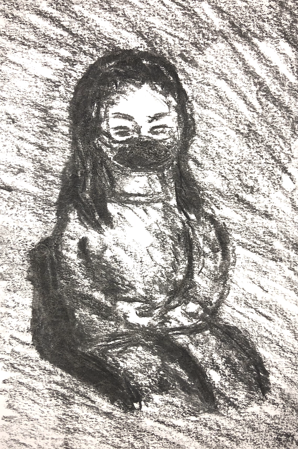
Charcoal

Biro

Ink

Markers
We developed our drawing skills using different materials such as charcoal, ink, markers and biro.
We did this because it opens us up to more options for our project during our production, it was a big change from doing digital artworks to physical, more traditional art. It gives us the chance to used mixed media.
We had a group of 5 people, 1 model and 4 observers. We each was a model and we all experimented with 4 different materials, drawing the other 4 models. We had 15 minutes to do these observational drawings and these portraits were the outcomes.
I learnt that it is good to experiment with as many different materials as possible so that if you are thinking of using mixed media in your work you have many options to turn too. I also learnt more about life drawing so experimenting with this was a beneficial skill development.
I could potentially use this in my project by incorporating some physical art into my production alongside my digital drawings. I could create some attributes of my digital artwork with physical materials.
Doing this would be a great idea as it can be linked to diversity, branching out from the usual materials and using a larger variety to diversify my work.
Intellectual Property
There are 4 different types of Intellectual Property: patents, trade secrets, copyrights & trademarks.
The idea of your Intellectual Property is something that you create, personally, using your own mind such as a piece of artwork.
In MGA, is it mandatory to know that you are not allowed to infringe on anyone's intellectual property as they own that specific thing. There are ways to avoid and prevent this from happening such as conducting research to make sure that what you make doesn't end up looking like somebody else's design. You can only use royalty-free attributes as they are free to use for anyone as they aren't owned by anyone.
You must gain permission from the owners if you want to use their work however you aren't allowed to use it for financial gain.
Sustainability
During our production it is important that we work sustainably. There are multiple ways to make sure that we are working sustainably such as putting our devices into sleep mode when not in use to save electricity and potentially reduce the risk of wearing out the device's battery.
Another way to work sustainably would be to reconsider whether you really need to print or use a lot of paper in general as it produces a lot of waste. If sketches can be drawn on devices then it would be better to do so.
Body Modelling
I decided to research more into 3D anatomy modelling to pick up any tips that may help me when I attempt to create my 3D model. I used the source linked above to help me understand in more depth about body modelling in Maya.
I watched through the tutorial and picked up a few tips and tricks from the video which I could use in my production. This tutorial is beneficial to my progress so that I am able to grasp body modelling faster so that I don't waste any time.
I will also practice this during my skills experimentation week so that I have an idea on how to execute this practically when it comes to production for my FMP.
The link I will be making between this and the theme of Diversity is through the addition of texture and colour. I will be using a variable colour palette and a variety of textures in my production to show a diverse selection of patterns.
Artist Research
Anna Bu Kliewer


Anna Bu Kliewer is a Gerkainian mixed media artist. She is based in London, UK.
She works in analogue and digital collage and has a continuous nature related theme throughout her work.
What I find interesting about her work is how she warps the audience's perception of inanimate objects and brings them to life. The contrast between the flat images in the background and the edited objects really projects the mixed media style.

A lot of her work pieces display a faceless person and it is often replaced with a plant, object or environment. Upon analysing more of her work I am able to see that she has an interest in diverting meanings of objects, this kind of style inspires me as it makes it all the more unique when you use a cross over of different media as it's out of the ordinary.
Her work actually executes a great idea of Diversity, with her use of different portraits, backgrounds, medias and objects/plants. Each piece gives a different impression on the audience so the theme of Diversity is very clear in her work.
Contrast
When creating my backgrounds and UV mapping/texturing my model I plan to colour them accordingly to make sure that they contrast and can be easily in front of each background.
I used this article in order to help me gain more knowledge on how to maximise the contrast between my background and model.
Alongside using different values there is also many ways, using the colour wheel, to contrast colour. All of the factors in colour help when trying to contrast two objects. Value, hue. saturation etc.
After looking through these tips I think I am going to more than likely experiment with differentiating values to achieve the level of contrast I am aiming for. This knowledge is going to benefit me a lot when it comes to texturing my model and colouring my backgrounds.


At this stage in my production I have already finalised one background and I am in progress of touching up my model. I am planning to develop and finalise three more backgrounds and due to my first background using low poly triangles, I might experiment with more shapes to keep the theme and also achieve contrast.


I could also contrast the texture of my model. When choosing my textures for my model I will make sure too choose ones that either have differentiating surfaces or colours. These silk and stone textures are a great example of contrasting textures as the stone one has sharp, rigged edges and harsher shadows whereas the silk texture has round edges, harsher highlights and the creases give it character so we are able to make the assumption that it is soft.
bottom of page